When trading cryptocurrency, reading charts accurately is essential. Understanding price movements helps traders identify the best buying and selling opportunities. Among the most fundamental tools for beginners are candlestick charts and moving averages.
This article will explain the basics of how to read cryptocurrency charts, focusing on candlestick patterns and moving averages.

1. What is a Cryptocurrency Chart?
A cryptocurrency chart visually represents price fluctuations over time. By analyzing these charts, traders can recognize patterns and make informed predictions about future price movements.
Most cryptocurrency exchanges offer different types of charts, including:
- Candlestick Charts (most widely used)
- Line Charts
- OHLC (Bar) Charts
Among these, the candlestick chart is the most popular and provides the most detailed price action analysis.
2. How to Read Candlestick Charts
What is a Candlestick?
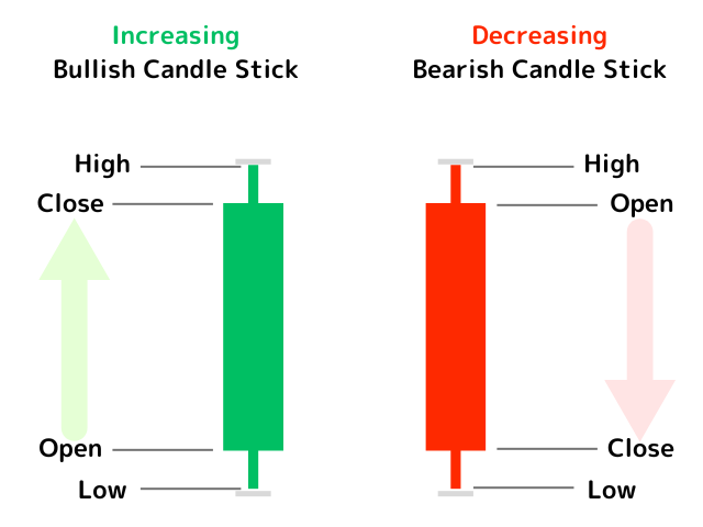
A candlestick represents price movement over a specific time period. Each candlestick provides four key price points:
- Open price: The price at the start of the period
- Close price: The price at the end of the period
- High price: The highest price during the period
- Low price: The lowest price during the period
Candlestick Structure
A candlestick consists of two main parts:
Body: The thick portion between the open and close prices
Wicks (Shadows): Thin lines extending above and below the body, representing the high and low prices
The color of a candlestick indicates the price movement:
Bullish Candle (Green/White) → Closing price is higher than the opening price (price increase)
Bearish Candle (Red/Black) → Closing price is lower than the opening price (price decrease)
Candlestick Timeframes
Exchanges allow users to select different timeframes for candlesticks, such as 1-minute, 5-minute, 1-hour, 4-hour, daily, and weekly charts.
- Short-term trading → 5-minute or 15-minute candles
- Mid-term trading → 1-hour or 4-hour candles
- Long-term investing → Daily or weekly candles
3. Common Candlestick Patterns
Recognizing candlestick patterns helps traders anticipate market trends. Here are some essential patterns:
1. Bullish Candle (Strong Uptrend)
Long green/white candle (close price significantly higher than open price)
Indicates strong buying pressure
2. Bearish Candle (Strong Downtrend)
Long red/black candle (close price significantly lower than open price)
Suggests strong selling pressure
3. Pin Bar (Reversal Signal)
A candlestick with a long wick and a small body
Long upper wick → Strong selling pressure
Long lower wick → Strong buying pressure
4. Engulfing Pattern (Trend Reversal)
A large candle that completely engulfs the previous one
Bullish Engulfing → A green/white candle engulfs a red/black candle (potential uptrend)
Bearish Engulfing → A red/black candle engulfs a green/white candle (potential downtrend)
4. Understanding Moving Averages (MA)
What is a Moving Average?
A moving average (MA) calculates the average price over a specific period, helping traders identify trends.
Types of Moving Averages
- Simple Moving Average (SMA): Calculates the average price over a fixed period (e.g., 50-day SMA, 200-day SMA).
- Exponential Moving Average (EMA): Gives more weight to recent prices, making it more responsive to price changes (preferred for short-term trading).
Short-Term, Mid-Term, and Long-Term MAs
Moving averages can be set for different periods depending on the trader’s strategy:
Short-term (5-day, 10-day MA) → Tracks short-term price trends
Mid-term (50-day, 100-day MA) → Identifies medium-term trends
Long-term (200-day MA) → Used for long-term market analysis
5. How to Use Moving Averages in Trading
1. Golden Cross (Bullish Signal)
The short-term moving average crosses above the long-term moving average
Signals a potential uptrend
2. Death Cross (Bearish Signal)
The short-term moving average crosses below the long-term moving average
Indicates a potential downtrend
3. Slope of the Moving Average
Upward slope → Indicates an uptrend
Downward slope → Indicates a downtrend
Conclusion
Understanding cryptocurrency chart analysis enables traders to make better-informed buying and selling decisions.
- Candlestick charts show open, close, high, and low prices, making them essential for trend analysis
- Moving averages help identify trend direction and market momentum
- Golden Cross & Death Cross signals can provide insight into potential trend shifts
For beginners, start by observing candlestick patterns and using moving averages to confirm trends. Once comfortable, you can explore more advanced technical analysis techniques to enhance your trading skills.